
.png)
The Challenge
The main challenges faced in this project stemmed from the complex structure and information overload present on the Service Laurier Enrolment Services webpages. The primary issues identified were:
- Overload of Information: The Service Laurier pages contained an overwhelming amount of information, making it difficult for students to find what they were looking for. This led to frustration, confusion, and ultimately a negative user experience.
- Unclear Labeling: The labels used throughout the pages didn't always align with students’ expectations, leading to confusion.
- Confusing Navigation: Students struggled to navigate the pages due to the layout and design. Important information was buried under multiple layers, with navigation that felt disjointed and counterintuitive. This hindered their ability to quickly access relevant data and made the browsing experience time-consuming.
Constraints:
- Limited Resources for Prototyping: While the project’s scope included extensive research and data collection, the final deliverable did not require a prototype. This constraint meant that we had to rely on insights from data analysis, user feedback, and research to drive our design decisions, rather than creating an interactive solution.
- Need for Data-Driven Solutions: Given the complexity of the issues at hand, we were constrained by the need to rely heavily on data-driven decisions.
- Stakeholder Expectations: The stakeholders, in this case, required actionable insights rather than a fully developed prototype. This meant the focus had to remain on providing recommendations based on empirical research rather than offering tangible design solutions that could immediately be implemented. While this approach allowed for flexibility, it also limited the immediate impact of the changes.
The Design Thinking Process
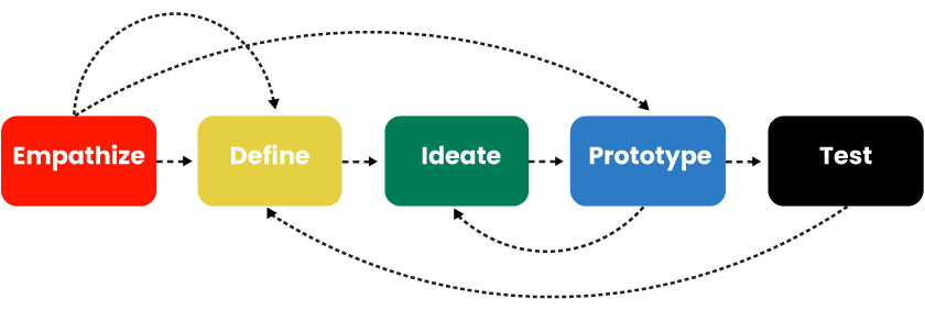
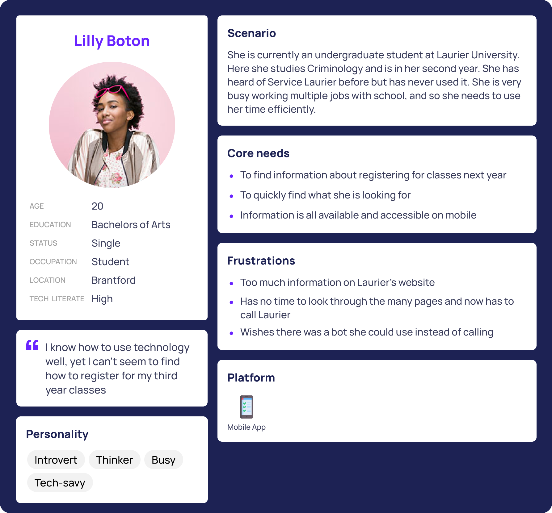
1. Empathize
We sought to understand the challenges students face when navigating the Service Laurier Enrollment Services web pages. We used personas and journey maps to better understand.
Target Users: Current and future Undergraduate students of Laurier.
.png)
.png)
.png)
2. Define
We synthesized our initial observations to clearly outline the main usability challenges of the Service Laurier Enrollment Services webpages. Our goal was to pinpoint specific problems students faced and establish a clear direction for improvements.This includes:
- Confusing Navigation
- Redundant & Disconnected Pages
- Unclear Labeling
- Lack of Quick Access to Key Information
4. Ideate
We brainstormed potential improvements to enhance the Service Laurier Enrollment Services webpages based on our initial assumptions about common usability challenges. Our focus was on simplifying navigation, improving clarity, and making key information more accessible.
5. Prototype & Test
Our clients didn’t want a prototype for the final deliverable, instead, we conducted in-depth data and research.
Research
We used many research methods and ensured that they were all tested on our target users. Many were reached through emails. We got over 30 participants throughout the studies.
Tree Test
This identifies key navigational issues. We created 3 tasks where users had to navigate through the existing site's structure and get to the correct destination.
1. You’re a Laurier student interested in taking a course at the University of Waterloo. Where can you find information on how to do this?
2. You want to figure out how much a semester will cost you, where would you find this information?3. You want to determine the time and date for this year's graduation. Where would you find this information?

Design Recommendations
Based on our research, here are some changes we recommend:
1. Financial Aid: Some students think that scholarships and bursaries should be included under this label. We recommend changing it to Tuition, Fees & Scholarships. This way we can merge the scholarship category with this, reducing the amount of clicks needed to find all information about money and the school.
2. Proxy Access: Many students didn’t understand what “proxy” meant, we recommend changing it to “Grant someone access to your account”.
3. Dynamic newsboard: Highlights the most frequently searched topics based on the academic calendar (e.g., financial aid in September). This way students don’t need to click through multiple pages and can access the information they need right away
4. Course Registration guide under enrolment services: students mistakenly clicked “Course Registration Guide” when trying to take a course at the University of Waterloo (Tree Test).

Conclusion
This project highlights my approach to user-centered design, combining research, usability testing, and iterative improvements to enhance navigation and accessibility. By restructuring information, refining labels, and streamlining key workflows, I created a more intuitive and efficient experience for users. While the redesign significantly improved usability, future iterations could further refine the experience through additional user testing and feature enhancements. This case study reflects my ability to analyze complex UX challenges, develop data-driven solutions, and create impactful designs that prioritize user needs.
