The Challenge
For users of all demographics to be able to access information quickly.
Constraints:
- Low Budget:The Sexual Assault Center is a non-profit organization, which makes securing funding a significant challenge. They depend heavily on grants and donations to compensate their staff. As a result, the tool we are developing must be cost-effective.
- Staff has Diverse Tech Proficiency: The majority of the SAC staff are volunteers, resulting in a diverse range of ages and skill levels. While some staff members may have limited technological expertise, others may be more proficient. Therefore, the tool we design must be intuitive and user-friendly to ensure accessibility for all staff members.
The Design Thinking Process
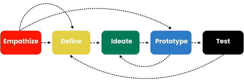
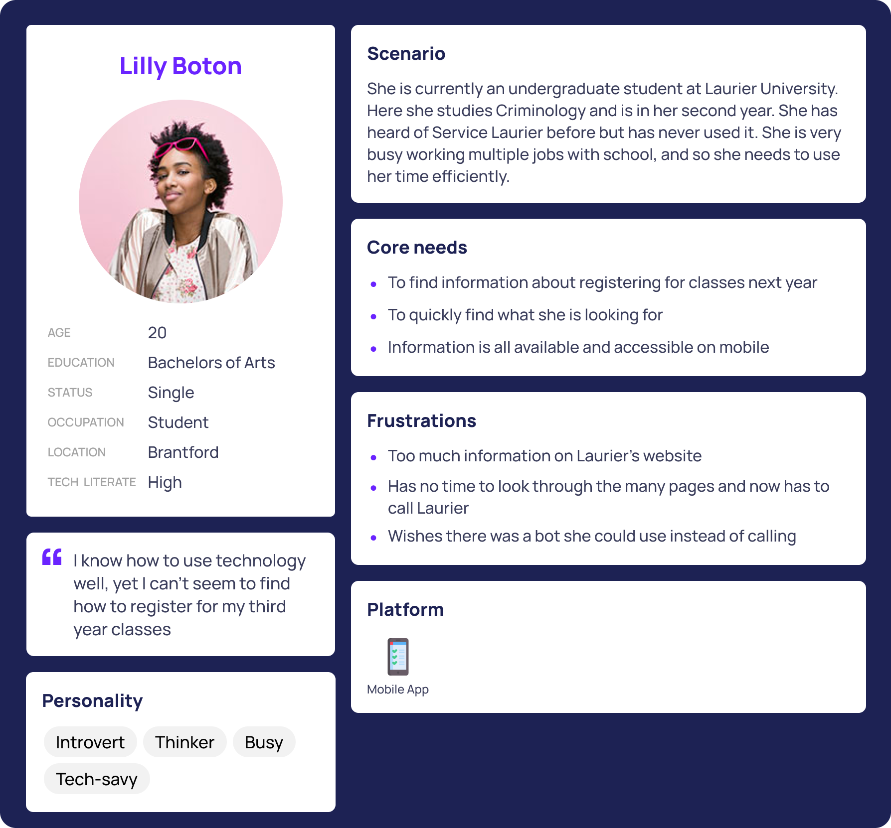
1. Empathize
The goal of the empathize stage was to understand the challenges SAC staff face when accessing resources for survivors. We identified 3 key pain points:
- Staff have varying levels of technological proficiency, from tech-savvy to less experienced users.
- The information they need is often scattered across different sources, making it difficult to quickly find what’s necessary.
- Many staff members rely on outdated or manual methods to access critical resources, leading to inefficiency and frustration.
Understanding these challenges helped us prioritize creating an intuitive, accessible solution to streamline their workflow.
.png)
.png)
.png)
2. Define
In the define stage, we synthesized the insights gathered during the empathize phase to clearly articulate the problem and establish a focused design direction. Our key findings led to the following problem statement:
- Problem Statement: Sexual Assault Center staff face significant challenges in accessing accurate and up-to-date resource information due to the lack of a centralized, user-friendly tool. Staff members with varying levels of technological proficiency struggle to quickly find essential services, leading to inefficiencies and frustration in their daily tasks.
Based on this, we outlined the following design goals:
- Create a simple, intuitive tool that consolidates all necessary information in one accessible platform.
- Ensure the tool is usable by staff with varying levels of technological expertise.
- Provide an easy-to-navigate interface that helps staff quickly locate and access critical resources.
These insights and goals served as the foundation for our ideation and prototyping phases.
3. Ideate
During the ideate phase, we brainstormed potential solutions to address the challenges identified in the define stage. Our goal was to generate a range of ideas that would meet the needs of SAC staff while ensuring accessibility and ease of use. Key ideas included:
- Centralized Information Database: A single platform containing all necessary resource details such as hours of operation, contact information, gender-specific services, and more.
- Interactive Map: An intuitive map-based interface that would display resources in layers (e.g., hospitals, police stations, SACs) to allow staff to easily navigate and access specific services.
- Customizable Filters: The ability to filter services by criteria like location, service type, and availability to streamline the search process.
We explored multiple variations of these ideas, focusing on simplicity and ease of use to ensure the tool would be effective for both tech-savvy and less experienced users. After narrowing down our concepts, we moved forward with prototyping the most promising solutions.
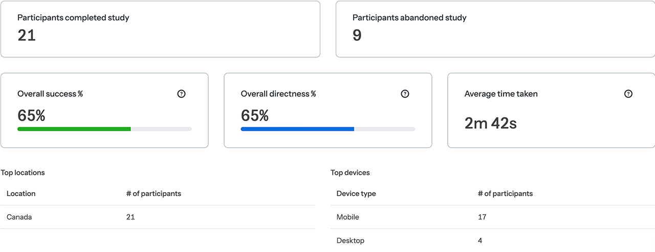
4. Test
In the test phase, we conducted thorough usability testing to assess how well the prototypes met the needs of SAC staff. Key activities included:
- User Testing: We tested the tool with a diverse group of users ranging from 12 to 60 years old, ensuring we included individuals with varying levels of technological expertise were able to navigate it efficently.
- Feedback Collection: Users interacted with both versions of the map, providing feedback on ease of use, navigation, and clarity of information. We focused on understanding if staff could quickly locate the resources they needed without confusion or frustration.
- Usability Issues: We identified areas where users struggled, such as difficulty understanding certain icons or trouble locating specific filters.
Based on the feedback, we made iterative changes to enhance the map's usability, improving the layout and simplifying the search features to ensure it was accessible to all staff members. This process helped us refine the tool and ensure it was both functional and user-friendly for the target audience.

Conclusion
Reflecting on this project, I gained valuable insights into the importance of user-centered design, especially when addressing diverse tech proficiency levels. The iterative process taught me how small adjustments, driven by real user feedback, can significantly improve usability.
Looking ahead, there are opportunities to enhance the tool with features like real-time updates or mobile app integration. Expanding the database and testing with a broader demographic will ensure the tool remains accessible and effective for all users. This experience has reinforced the value of designing practical, inclusive solutions that directly meet the needs of users.
For information here is out final presentation pitch:
.png)
